Frezcha Herbal Tea Brand Identity & Mascot Design
Rooted in Heritage, Elevated for Today
Frezcha began as a local favourite known for its nostalgic herbal drinks — but the original logo felt dated, generic, and lacked the premium edge needed to attract a new generation of customers. The brand needed a refresh that could embody both tradition and modernity, standing out confidently in Singapore’s highly competitive beverage scene.
Brand Identity Design | Rebranding | Mascot Design | Packaging Design

Why Rebrand?
Frezcha wanted to move beyond looking like “just another traditional drink shop.” The old identity leaned heavily on traditional motifs and felt cluttered, blending in rather than standing out. The goal was to transform Frezcha into a true lifestyle brand — one that feels proudly local yet aspirational, capable of connecting with a new generation of consumers both online and offline.

The Transformation
The Strategy
The core strategy was to modernise the brand without losing its soul. By blending contemporary minimalism with heritage cues, Frezcha could resonate with younger audiences while staying true to its roots. The slogan Shiok Herbal Sips became a strategic differentiator — positioning Frezcha not just as another drink brand, but as a refreshing lifestyle choice that celebrates local flavours in a fun, memorable way.
Logo Concept
The new Frezcha logo seamlessly combines modern design with a touch of tradition, representing the brand’s unique blend of classic herbal drinks and a refreshing, contemporary twist.
The bold, clean sans-serif typography conveys trust, quality, and timeless appeal, while the playful handwritten tagline in red — Shiok Herbal Sips — introduces warmth and nostalgia, evoking memories of local favourites. The striking contrast of black and red symbolises the fusion of modern innovation with heritage, embodying Frezcha’s fresh take on traditional flavours.
Overall, the design is simple, vibrant, and approachable, capturing the essence of an everyday, healthier refreshment that resonates with the Singaporean spirit.

Colour Palette
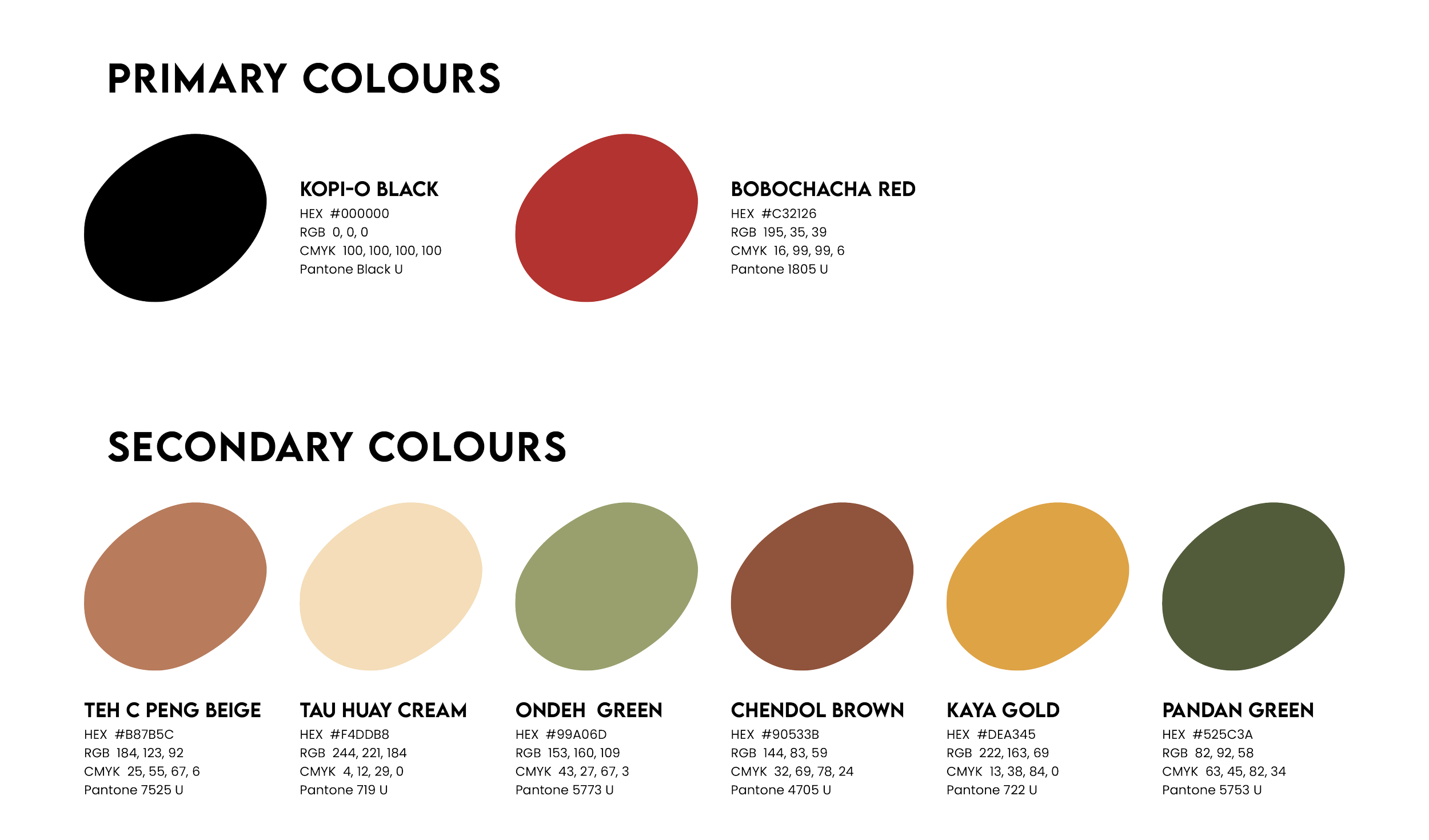
The Frezcha palette blends earthy, comforting tones with vibrant highlights, creating a modern yet deeply nostalgic identity. Each colour is carefully chosen to tell a story — evoking Singapore’s beloved local flavours and cherished cultural moments.
From Kopi-O Black to Ondeh Green and Kaya Gold, these shades weave together a tapestry of tradition, nature, and warmth. The result is a palette that feels both contemporary and timeless, embodying the essence of Frezcha: heritage, revitalised.

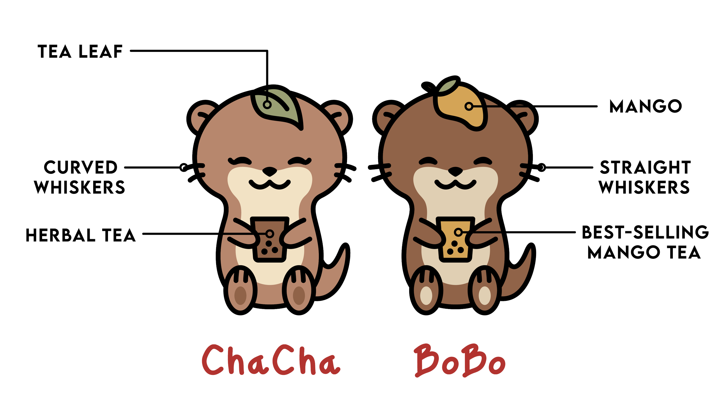
Meet the Faces of Frezcha
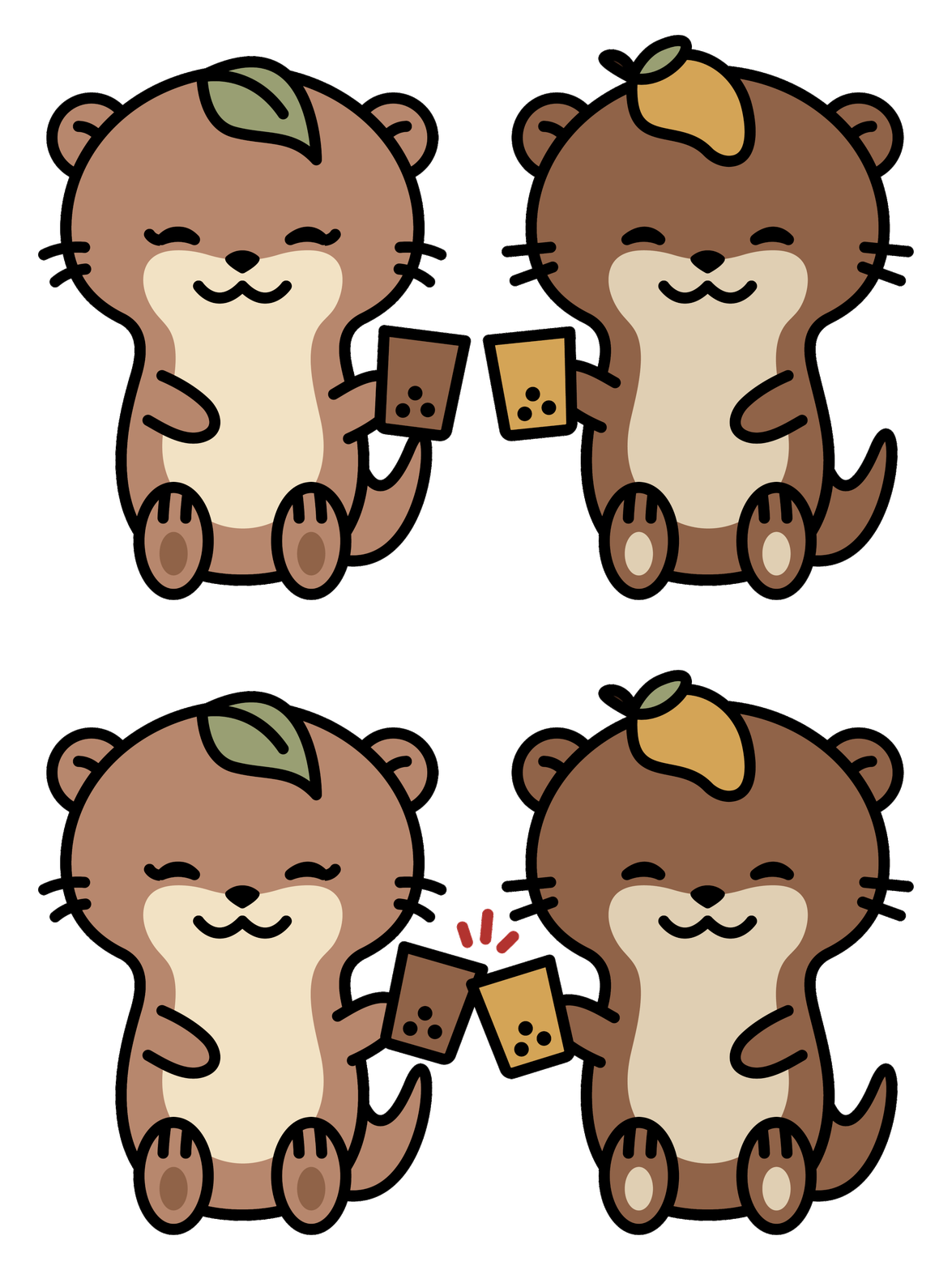
"ChaCha" connects to Frezcha through the shared "Cha" (茶), meaning tea in Chinese — highlighting the brand’s focus on herbal brews. "BoBo" brings a playful, bubbly personality, while also referencing bubble tea pearls, reinforcing the brand’s modern twist. Together, BoBoChaCha cheekily nods to the beloved local dessert bo bo cha cha, grounding the mascots in Singapore’s culture and heritage.
This adorable duo perfectly embodies Frezcha’s mission: blending tradition and innovation into a uniquely Singaporean tea experience — one that’s both nostalgic and refreshingly fun.

Takeaway Cooler Bag
More than just packaging — this cooler bag becomes a moving brand ambassador.
On one side, the minimalist Frezcha logo and slogan establish a clean, premium identity. On the other, a bold, playful graphic featuring "Shiok Herbal Sips" paired with the brand mascot, ChaCha, and the phrase "Anywhere, Anytime" reinforces Frezcha’s promise of convenience and joyful indulgence.
The strategic addition of "Anywhere, Anytime" turns the slogan into an invitation: enjoy Frezcha on-the-go, wherever life takes you. By integrating the mascot, the bag strengthens emotional connection and boosts recall, transforming every outing into a brand experience.
Designed to stand out in public spaces, this cooler bag embodies Frezcha’s mission — making nostalgic, heritage-inspired drinks part of modern, everyday life.


