Virtue Medical
Brand Identity Design
A modern approach to family-centred care.
In an era of rushed consultations and fragmented specialist care, Virtue Medical set out to revive what truly matters: a genuine doctor-patient relationship built on trust, empathy, and human connection.
The brand identity was crafted to reflect this mission — positioning Virtue Medical as a lifelong healthcare partner, supporting families from cradle to old age. Through approachable visuals and a warm, community-focused tone, the brand embodies its promise of people-first care and personal attention in every interaction.
Brand Identity Design | Web Design

Logo Concept
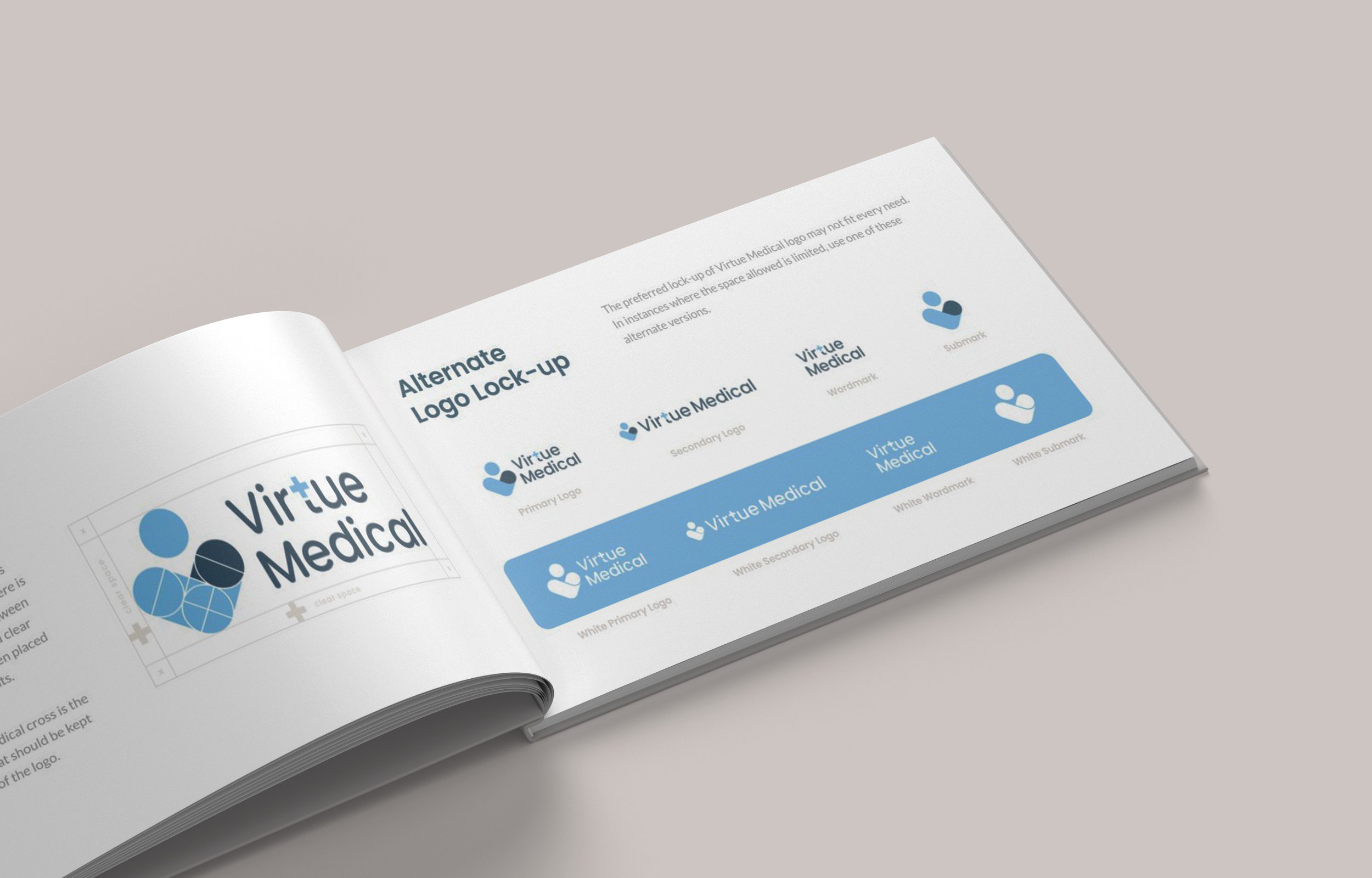
The brand submark cleverly weaves together the clinic’s initial with a pair of hands — symbolising care, protection, and warmth at the heart of Virtue Medical’s mission. The circle within the icon forms a person, representing community and reinforcing the brand’s commitment to people-centred care.
By integrating the medical cross into the wordmark, the logo establishes an immediate association with healthcare, building trust and credibility among patients and their families. Altogether, the design embodies compassion, connection, and a lifelong partnership in health.

Illustrations
Virtue Medical’s watercolour-style illustrations breathe life into the brand, transforming what could be a cold, clinical experience into something warm, human, and deeply reassuring.
Soft brush textures and gentle colour transitions create an inviting visual language that feels personal and sincere. Each illustration — whether it’s a caring family scene or a confident, healthy figure — is designed to evoke trust and ease, helping patients feel safe and supported from their very first online interaction.
All Roads Lead to Virtue Medical
A standout visual element is the “rainbow roads” leading to the clinic — a subtle yet powerful metaphor suggesting that all roads lead to Virtue Medical. This conceptual touch reinforces the brand’s promise of being a central, welcoming destination for comprehensive care at every life stage.
Beyond aesthetics, these illustrations serve as an emotional bridge. They demystify medical topics, simplify service explanations, and embody Virtue Medical’s core values of empathy, connection, and community care — turning medical services into approachable stories that patients can relate to and remember.


